Visual improvements in DARK NEBULA
The next update to Hades' Star is bringing numerous visual (and audio) improvements, focusing on providing better clarity of mechanics and immediate feedback on what each player is doing in all star types. Here are some key areas of this effort:
USER INTERFACE
We are making hundreds of big and small big tweaks to Hades' Star interface, focusing on usability and clearer display of relevant information.
We are enriching many windows with detailed 3D objects that help associate interface elements with in game objects. Some examples include the all new Planet list, and the Production page:
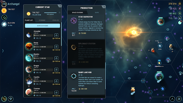 |
We are also fixing many usability issues, such as old HUD buttons getting mixed up with the game world because of low opacity, and moving the chat toggle button under the object selection bar (a common complaint from mobile users). The improved Ships List will be available for the first time to the majority of players who play on a phone.
PLANETS AND YELLOW STAR SYSTEM
Hades' Star planets are already doing a great job of visualizing a distant, mysterious part of space. In addition to the existing planets, we will also be adding premium designs:
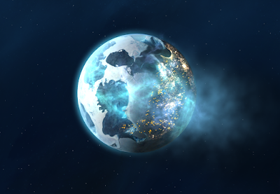 |
| One of many premium planet designs coming to Hades' Star |
The increased overall brightness of the Yellow Star is likely the first visual change you will notice when your account is upgraded after the update. This change brings a lot of detail that was previously washed out (i.e. shadows from asteroids that weren't very close to the star). It also makes it easier on the eyes to play the game for prolonged period of times, and helps with the commonly mentioned problem that it's too hard to play Hades' Star on a mobile device when outdoors.
SHIPS
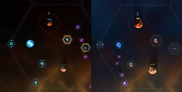
We are keeping the 2D icon look of ships but enhancing it with better defined edges, making them easier to distinguish when clumped together, and giving them more depth and character. Other tweaks allow the game to better display the status of each ship. Transports and Miners will clearly show at a glance what type of cargo they are carrying, and how close to full they are:
 |
| New Dark Nebula Ship visuals are shown to the right |
All ships will get a clearly defined center point (seen as a distinct black dot in the new ship graphics). This center point is used for all combat targeting, fixing numerous problems with targeting order and module range.
SPACE STATIONS
Stations are moving away from icon visuals and into more clear, detailed representation of their functionality. The Star Scanners will now be very easy to distinguish at any zoom level by their color, and many buildings will have special animations to show they are busy (i.e. the Research Station will light up when it's working on Artifacts).
 |
| New Dark Nebula Ship visuals are shown to the right |
MODULES
Many modules will be accompanied by brand new visual effects and (for the first time) sound effects, helping the game better show cause and effect. These changes are synced with all the other changes to gameplay in Red, White and Blue Stars, and have been designed to make each star type more exciting to play every single day.
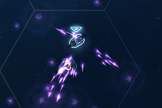 |
| New effect for the Crunch module |
